

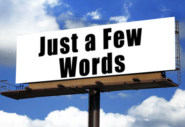
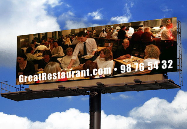
Express the most important idea concisely. Use short copy lines. Seven words or less. Make sure the advertiser’s name is legible. Try to use either a website or a phone number, but not both.
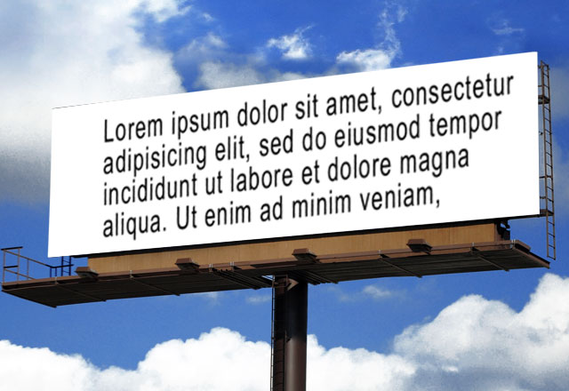
Large copies make the message dissapear from the the viewers eyes.
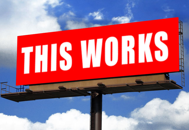
Use bold colors. Being subtle from 600 feet does not work. Forget about white space. It does not apply in outdoor like in print. Use contrasting colors, they read better from a distance.
The use of shades of color without strong contrast is a bad idea.
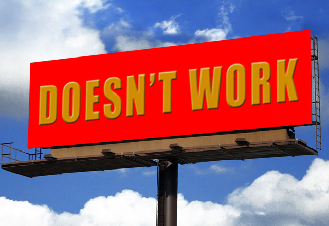
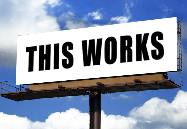
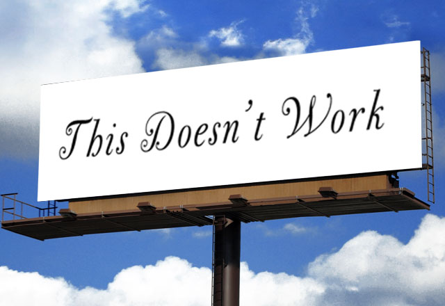
Use bold, non-serif fonts. Avoid decorative, italic or thin serif fonts.
Thin typeface with extensive serifs is very hard to read while driving.
Choose images with simple backgrounds. Avoid using landscapes or complex scenes. Make a small object large rather than a large object small.
Thin typeface with extensive serifs is very hard to read while driving.

Finaly, it is a very good idea to show your design to someone for seven seconds. Did they get it?
View your design from a distance. Does it read from fifteen feet away?